: Tape-in extensions, one time use set of hair, 2nd generation of seamless tape in extensions, more invisible and natural than traditional tape in remy hairpieces in the market, can meet your need more perfectly
: more sticky&durable, once you put them in, the tapes will hold well for 6-8 weeks(with good care), medical-grade glue, harmless to use, damaged-hair friendly, we will provide extra 10pcs tapes for replacement
: 100% selected remy hair, no synthetic mixed, soft&smooth, shedding&tangle free, blends well with your hair, straight texture, restylable, 20pcs/pack, 2.5g/piece,Each pack contains 20 pieces, 12 inches-16 inches each weighs 40 grams, and 16 inches-24 inches each weighs 50 grams. 1-2 sets for highlight, fuller look needs more sets
: just use tape in natural hair sandwich your own hair, you can install them by yourself, If you go to the barber shop for professional help, you can get your hair extensions in less than an hour
: avoid frequent washing, a good dry shampoo will be helpful, if you want to have them removed, it’s recommended to do it with glue remover, color variation is inevitable, if you have any further question, we’re glad to help you
/*
* Used when device = desktop
* Configured in: configuration/brazil-config/global/brand-story.cfg
*/
/* Because the carousel is implemented as an ol list,
any lists in the card text will have a secondary list style (letters).
This will give an incorrect appearance to viewers,
so we set all lists to the primary list style (numbers). */
.aplus-brand-story-card ol li {
list-style: decimal;
}
/* Top level containers */
.aplus-module .apm-brand-story-hero {
-moz-box-sizing: border-box;
-webkit-box-sizing: border-box;
box-sizing: border-box;
width: 1464px;
height: 625px;
background-color: #fff;
}
.aplus-module .apm-brand-story-card {
-moz-box-sizing: border-box;
-webkit-box-sizing: border-box;
box-sizing: border-box;
width: 362px;
height: 453px;
background-color: #fff;
}
.apm-brand-story-hero,
.apm-brand-story-card {
-moz-box-sizing: border-box;
-webkit-box-sizing: border-box;
box-sizing: border-box;
position: relative;
width: 100%;
height: 100%;
float: none;
}
.aplus-module.brand-story-card-1-four-asin .apm-brand-story-card {
/* Only 12px to account for image cell border */
padding: 12px;
}
/* Full background image (Hero 1 & Card 2) */
.aplus-module .apm-brand-story-background-image {
-moz-box-sizing: border-box;
-webkit-box-sizing: border-box;
box-sizing: border-box;
overflow: hidden;
position: absolute;
width: 100%;
height: 100%;
}
/* Card 1 small images */
.aplus-module .apm-brand-story-image-row {
-moz-box-sizing: border-box;
-webkit-box-sizing: border-box;
box-sizing: border-box;
height: 185px;
padding: 0px;
margin: auto;
display: flex;
}
.aplus-module .apm-brand-story-image-row .apm-brand-story-image-cell {
/* Use content-box to ensure image size matches editor schema */
-moz-box-sizing: content-box;
-webkit-box-sizing: content-box;
box-sizing: content-box;
padding: 0px;
margin: 0px;
width: 166px;
border: 1px solid #fff;
}
.aplus-module .apm-brand-story-image-row .apm-brand-story-image-cell .apm-brand-story-image-link {
display: block;
width: 100%;
height: 100%;
}
.aplus-module .apm-brand-story-image-row .apm-brand-story-image-cell .apm-brand-story-image-link .apm-brand-story-image-img {
display: block;
width: 100%;
height: 100%;
object-fit: cover;
}
/* Card 3 logo image */
.aplus-module .apm-brand-story-logo-image {
-moz-box-sizing: content-box;
-webkit-box-sizing: content-box;
box-sizing: content-box;
height: 145px;
margin: 0px 4px;
padding: 20px;
padding-bottom: 0px;
}
/* Text overlays */
.aplus-module .apm-brand-story-text-bottom {
-moz-box-sizing: border-box;
-webkit-box-sizing: border-box;
box-sizing: border-box;
position: absolute;
bottom: 13px;
left: 13px;
}
.aplus-module .apm-brand-story-hero .apm-brand-story-text-bottom {
background-color: rgba(0,0,0,0.6);
color: #fff;
padding: 13px 65px 13px 13px; /* accounts for overlap of first card */
width: 437px;
}
.aplus-module.brand-story-card-2-media-asset .apm-brand-story-text-bottom {
background-color: rgba(255,255,255,0.6);
color: #000;
padding: 13px;
width: 336px;
}
.aplus-module.brand-story-card-1-four-asin .apm-brand-story-text {
margin-top: 8px;
}
.aplus-module.brand-story-card-1-four-asin .apm-brand-story-text.apm-brand-story-text-single {
margin-top: 20px;
}
.aplus-module.brand-story-card-1-four-asin .apm-brand-story-text h3 {
white-space: nowrap;
overflow: hidden;
text-overflow: ellipsis;
}
.aplus-module .apm-brand-story-slogan-text {
-moz-box-sizing: content-box;
-webkit-box-sizing: content-box;
box-sizing: content-box;
margin: 0px 4px;
padding: 20px;
}
.aplus-module .apm-brand-story-faq {
-moz-box-sizing: content-box;
-webkit-box-sizing: content-box;
box-sizing: content-box;
padding-top: 10px;
}
.aplus-module .apm-brand-story-faq-block {
margin: 0px 10px;
padding: 10px;
}
.aplus-v2 .apm-brand-story-carousel-container {
position: relative;
}
.aplus-v2 .apm-brand-story-carousel-hero-container,
.aplus-v2 .apm-brand-story-carousel-hero-container > div {
position: absolute;
width: 100%;
}
/*
Ensuring the carousel takes only the space it needs.
The sizes need to be set again on the absolutely positioned elements so they can take up space.
*/
.aplus-v2 .apm-brand-story-carousel-container,
.aplus-v2 .apm-brand-story-carousel-hero-container {
height: 625px;
width: calc(100% + 15px);
max-width: 1464px;
margin-left: auto;
margin-right: auto;
}
/*
This centers the carousel vertically on top of the hero image container and after the logo area (125px).
Margin-top = (heroHeight – cardHeight – logoAreaHeight) / 2 + logoAreaHeight
*/
.aplus-v2 .apm-brand-story-carousel .a-carousel-row-inner{
margin-top: 149px;
}
/*
Cards need to have a width set, otherwise they default to 50px or so.
All cards must have the same width. The carousel will resize itself so all cards take the width of the largest card.
The left margin is for leaving a space between each card.
*/
.aplus-v2 .apm-brand-story-carousel .a-carousel-card {
width: 362px;
margin-left: 30px !important;
}
/* styling the navigation buttons so they are taller, flush with the sides, and have a clean white background */
.aplus-v2 .apm-brand-story-carousel .a-carousel-col.a-carousel-left,
.aplus-v2 .apm-brand-story-carousel .a-carousel-col.a-carousel-right {
padding: 0px;
}
.aplus-v2 .apm-brand-story-carousel .a-carousel-col.a-carousel-left .a-button-image,
.aplus-v2 .apm-brand-story-carousel .a-carousel-col.a-carousel-right .a-button-image {
border: none;
margin: 0px;
}
.aplus-v2 .apm-brand-story-carousel .a-carousel-col.a-carousel-left .a-button-image .a-button-inner,
.aplus-v2 .apm-brand-story-carousel .a-carousel-col.a-carousel-right .a-button-image .a-button-inner {
background: #fff;
padding: 20px 6px;
}
.aplus-v2 .apm-brand-story-carousel .a-carousel-col.a-carousel-left .a-button-image .a-button-inner {
border-radius: 0px 4px 4px 0px;
}
.aplus-v2 .apm-brand-story-carousel .a-carousel-col.a-carousel-right .a-button-image .a-button-inner {
border-radius: 4px 0px 0px 4px;
}
Vogue and Grace are all available within Benehair
Previo
-
-
135 Products for Choice
-
22 Colors for Fashion
-
8 Years for Better Hair
Good Hair, Good Mood, Good Life.
-
Seamless Clip ins Human Hair
-
-
Hot Colors in Clip ins Hair
-
Clip ins Hair Extensions 8pcs
-
-
-
-
Hot Colors in Topper no bangs
-
Topper Human Hair No Bangs
-
Hot Colors in Thick Line Hair
-
Thick Line Real Hair Extension
-
Hot Colors in One Piece Clip’n
-
Clip in Extension One Piece
-
Hot Colors in 1 Piece 5 Clips
-
One Piece Hair Extensions
Next page

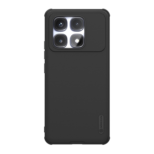 For Redmi K70 Ultra NILLKIN Frosted Shield Pro Magnetic Phone Case(Black)
$7.10
For Redmi K70 Ultra NILLKIN Frosted Shield Pro Magnetic Phone Case(Black)
$7.10
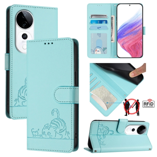 For vivo S19 Pro Cat Rat Embossed Pattern RFID Leather Phone Case with Lanyard(Mint Green)
$3.70
For vivo S19 Pro Cat Rat Embossed Pattern RFID Leather Phone Case with Lanyard(Mint Green)
$3.70
 100 Used Tennis Balls - LOW COST DOG BALLS - FREE SHIPPING
$47.30
100 Used Tennis Balls - LOW COST DOG BALLS - FREE SHIPPING
$47.30
 Solinco HYPER-G 16L 1.20mm (green) 656ft 200m Tennis String Reel
$121.00
Solinco HYPER-G 16L 1.20mm (green) 656ft 200m Tennis String Reel
$121.00
 Aluminium Bajaj Neka Frying Pan
 Choker Necklaces & Pendants Statement Fashion Jewelry For Women Boho Vintage Leather Bijoux Collar
 New Fashion Silver Necklaces and Pendants for Women Kitten Cat Simulated Pearl Necklace
 Crystal Gem Retro Dream Moon Pendant Necklace Jewelry
 Dagu Women Classical Large Round Circle Statement Bib Choker Pendant Necklace


 English
 Arabic